In the graphical part of the mission preview, the values on the axes of the graphs are not clearly visible.
What I'm sending you isn't a real bug, it just makes it a little uncomfortable to use. In the WEB app at the graphical part of the mission preview, the values on the axes of the graphs are not clearly visible. See the attached prints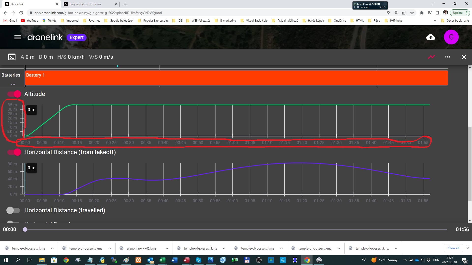 creen.
Comments
14 comments
Gábor Bokrossy, looks ok here, what browser are you using this is taken from Waterfox
It is there in Firefox, but it is pretty light colored. I can read, but a tad bit more contrast would be okay too for my tired "older" eyes. Your dark area seems darker.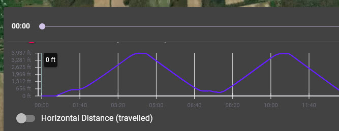
Just for curiosity I tried using Windows "High Contrast" settings. While it made a big difference, it didn't help this, and it made it impossible to respond on the forum!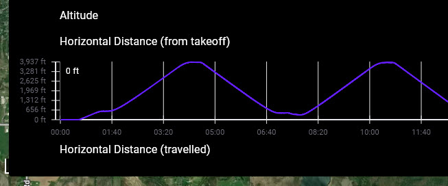
Hi Martin, I am using Google Chrome, but it seems Firefox has the same problem...
Gábor Bokrossy, that's strange as it's ok here in firefox as well
This is in edge, which is the closest to chrome that's on my system, and yes its terrible
I didn't try Firefox. I sent to you my comment based on George K report. See it in this message flow...
Yet my firefox one is fine, its really weird
I'm wondering if it has something to do with what theme is used in firefox, I user one called littlefox, both in firefox and waterfox
Martin, it would be great if DL could modify the color of the values on the axes to the same color as "Altitude", "Gimbal", "Batteries" text have.
Yeah agreed that would be a lot better
Just one of the many reasons I only use the Light theme. When I switched to the Dark side of the force it seems ok even though it is lighter. Seems like it may be different depending on the Device or PC and the settings.
I did switch to light theme just now, and it is easier to view. Thanks, hadn't thought about that.
Mine are both done with dark theme (windows system default)
This will be corrected in the next release.
Please sign in to leave a comment.